As an IELTS instructor with over 20 years of experience, I understand the challenges test-takers face, particularly in Writing Task 1. This comprehensive guide will equip you with the knowledge and strategies to confidently tackle this task and achieve a high band score.
Nội dung bài viết
- Understanding IELTS Writing Task 1
- Approaching Different Task 1 Question Types
- 1. Line Graphs
- 2. Bar Charts
- 3. Pie Charts
- 4. Tables
- 5. Process Diagrams
- 6. Maps
- Strategies for Success
- 1. Analyze the Visual Carefully
- 2. Plan Your Response
- 3. Use Accurate and Varied Language
- 4. Proofread for Errors
- Example: Line Graph
- Tips to Enhance Your Score
Understanding IELTS Writing Task 1
Writing Task 1 requires you to write a minimum of 150 words, summarizing, analyzing, and reporting information presented visually. You are assessed on your ability to:
- Paraphrase: Rephrase the given information using your own words.
- Identify key features: Accurately recognize and highlight the most significant trends and patterns in the data.
- Compare and contrast: Analyze and describe similarities and differences between data points.
- Report accurately: Present the information clearly and factually, avoiding personal opinions or interpretations.
- Use appropriate language: Utilize a range of vocabulary and grammatical structures relevant to describing data and trends.
- Structure your response: Organize your answer logically with a clear introduction, body paragraphs, and conclusion.
Approaching Different Task 1 Question Types
IELTS Writing Task 1 typically features visual data in various formats:
1. Line Graphs
- Focus: Illustrate trends and changes over time.
- Key Language: Verbs of increase/decrease (rise, fall, fluctuate, plateau), adverbs of degree (sharply, gradually, steadily), prepositions of time (from…to, between…and, over/during).
2. Bar Charts
- Focus: Compare and contrast different categories at a specific point in time.
- Key Language: Superlative adjectives (highest, lowest, most significant), comparative adjectives (higher than, lower than), language of proportion (twice as much as, half as many as).
3. Pie Charts
- Focus: Show proportions and percentages of a whole.
- Key Language: Fractions (one-third, a quarter), percentages (25%, 50%), expressions of proportion (the majority, a minority, the largest/smallest segment).
4. Tables
- Focus: Present numerical data in rows and columns.
- Key Language: Language of ranking (highest, lowest, second-highest), expressions of difference (a difference of, a gap of), language of comparison (in comparison to, compared with).
5. Process Diagrams
- Focus: Describe a process or sequence of events.
- Key Language: Sequencing words (firstly, secondly, next, finally), passive voice (is done, are made), verbs of process (begin, transform, produce).
6. Maps
- Focus: Illustrate geographical changes over time or compare different locations.
- Key Language: Prepositions of place (to the north, in the south-east), language of direction (clockwise, anti-clockwise), verbs of change (expand, develop, relocate).
Strategies for Success
1. Analyze the Visual Carefully
- Spend a few minutes understanding the type of visual, the axes labels, units of measurement, and the overall trend.
- Identify the key features that stand out and require detailed description.
2. Plan Your Response
- Organize your thoughts before writing.
- A common structure is:
- Introduction: Paraphrase the task and briefly state the main trend.
- Overview: Highlight the most significant features or trends (usually 2-3).
- Body Paragraphs: Describe specific details and support your points with data from the visual.
- Conclusion: Summarize the key trends or provide a concluding statement (optional).
3. Use Accurate and Varied Language
- Avoid repeating the same vocabulary or grammatical structures.
- Employ synonyms, different sentence structures, and a range of descriptive language.
4. Proofread for Errors
- Allocate time to review your writing for grammar, spelling, and punctuation errors.
Example: Line Graph
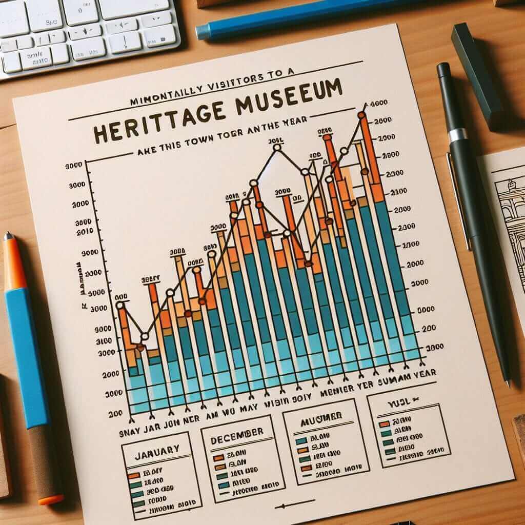
The line graph below shows the number of visitors to a museum in a year.
 Museum Visitors Line Graph
Write a report for a university lecturer describing the information shown.
Sample Answer:
The line graph illustrates the monthly visitor figures for a particular museum over a one-year period.
Overall, the number of visitors to the museum fluctuated significantly throughout the year. The most noticeable trend was a sharp increase in attendance during the summer months, followed by a decline in the autumn.
In January, the museum welcomed approximately 10,000 visitors. This figure steadily rose to 15,000 in February and March before surging to a peak of 40,000 in July. Following this peak season, visitor numbers experienced a steep decline, falling back to 15,000 by October. Attendance remained relatively stable throughout the remaining months of the year, with a slight dip in December to 12,000.
Tips to Enhance Your Score
- Practice regularly: Familiarize yourself with different task types and time yourself.
- Seek feedback: Have an experienced IELTS instructor or tutor evaluate your writing and provide suggestions for improvement.
- Analyze model answers: Pay attention to the language, structure, and coherence of high-scoring responses.
By following this comprehensive guide and implementing the strategies outlined, you’ll be well on your way to mastering IELTS Writing Task 1 and achieving your desired band score.


